
Re-Designing FarEye's Mobile Application
FarEye's mobile application is a Task Management Solution provided to Manufacturers,
Retailers and Logistics for last mile delivery across the globe. The redesigning was done keeping in mind the users coming from different ethnic backgrounds and understanding of technology.
Functionality does help complete a task but may not always be user friendly. Understanding the model and leveraging useful elements from the older design maintained familiarity for the existing users.
#interactiondesign #visualdesign #productdesign #designsystem
Utility for Mobility
My Role
Contextual Research
UX Designer
Interface Designer
Prototyping
Team
Two Designers
( Including me )
Research Tools
User Personas
The Expert Review
Ethnographic Research
Design Approach

Understanding the Problem
We collected feedbacks from users regarding the problems they were facing while using the app. We shortlisted a few basic and important points.
-
Outdated design
-
Design not user friendly
-
Lack of Affordances
-
Inconsistent visual framework
-
Poor feedback
-
Lack of proper information


Screens from the old designs.
Research
Understanding the User

Setting the Goals
Our goal was to create a seamless experience for the users that would lead to faster task completion with less errors and help them achieve their goals. As the product was divided into multiple modules, maintaining consistency in framework across the product was of great value. Our ambitions were to create a strong foundation that embraced a rapidly evolving business and more diverse user base.
Our high level goals were to :
-
Make it fast by reducing the number of taps to be able to use it on the go.
-
Make it simple and easy to understand by a refined visual framework.
-
Design a platform for deeper engagement, better productivity and growth in business profitability
Sketches/wireframe + Workflow

Design
Based on our insights, we decided to design a workable solution. We decided to work in a close feedback loop with rapid iterations.
Disclaimer : To comply with my NDA, I’ve omitted multiple iterations and confidential data from this section.

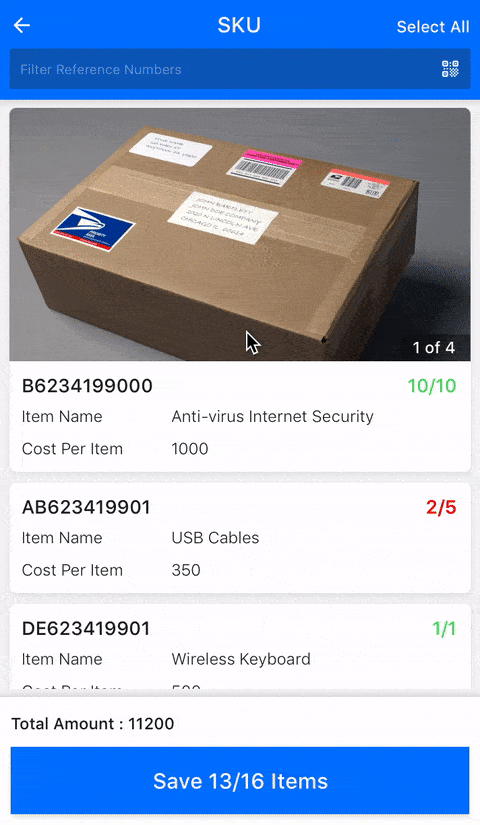
Overview I
-
Visibility of selected form attribute with help text and its respective state.
-
Buttons with icon and clear hierarchy.
-
Clean and minimalist design.
Overview II
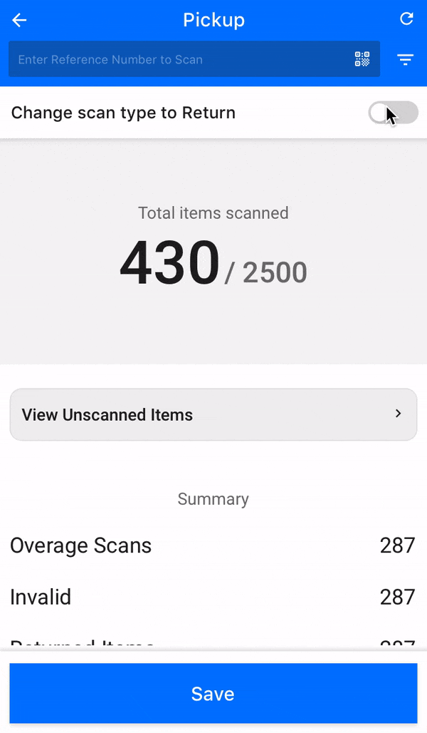
-
Big and Bold digits for clear reading from an arm's distance.
-
Feedback : Change of colour when switched to other "Scan type" for better Recognition of either operation and less error.
-
To avoid errors and fraud cases, the flow can be initiated only when all parameters are checked.
-
Large thumbnail of images for product confirmation.
Overview III
-
To avoid errors and fraud cases, the flow can be initiated only when all parameters are checked.
-
Large thumbnail of images for product confirmation.
Overview IV
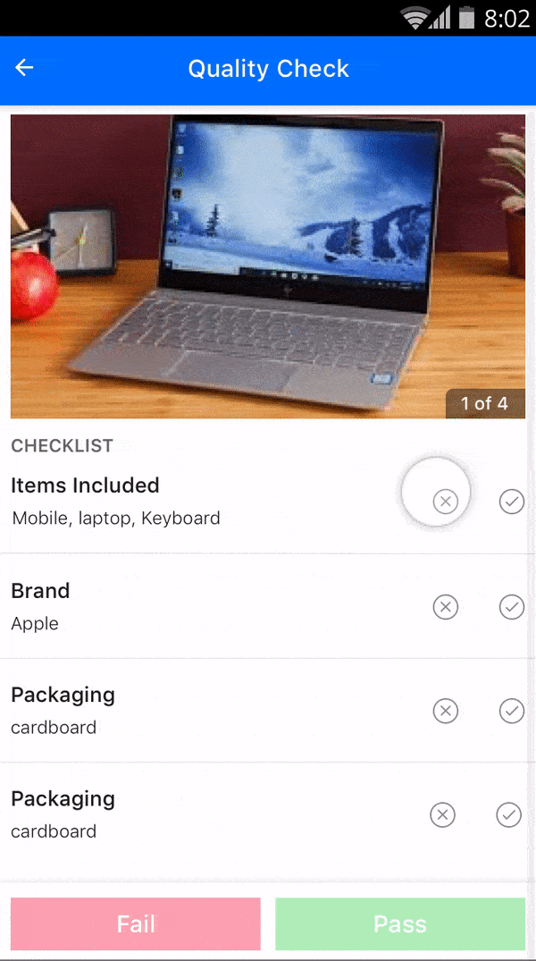
-
Easy visibility of map with a route and a list of tasks.
-
Better ergonomics : Easy reach for thumb to perform actions.


Overview V
-
Providing progress bar helps the user easily understand the completion of tasks.
-
Maintaining hierarchy by adding contrasting colours to point focus on important issues.